A recent Apple update made some everyday actions in our asset menu harder to reach. Frequently used actions were tucked away in submenus, and expanding the menu revealed duplicate entries for actions that were already visible. The menu itself could appear above or below an image depending on where the image was on screen, making it harder to know where to look. Even locking a picture could take up to three taps!
With more changes to in-app menus coming in iOS 27, and users sharing similar frustrations, it felt like the right time to give the asset action menu a complete redesign. But this raises an interesting question: how do you design an interface that feels just right? Here's a look at how we usually approach it!
The first step in designing any interface is to understand the entire process from the user's perspective. No matter how useful a feature might be, if accessing it requires a complicated series of interactions, it quickly becomes more of a burden than a benefit.
Our main goal here was predictability. Each action needed its own dedicated spot, so you could always find it in the same place, whatever the situation. Even when the available options changed, the layout would stay familiar. That way, you can focus on what you want to do, without having to figure out the menu all over again. Over time, that consistency helps build muscle memory: you no longer have to think about where to press.
Then comes my favorite part: imagining the interface itself.
At this stage, every member of the Endless Paper team who feels inspired is free to explore different approaches and sketch out their own versions of the interface. We deliberately avoid getting attached to a single concept too early, experimenting with different layouts, shapes, and interactions.
And then comes the back and forth: comparing designs, discussing their advantages and drawbacks, and refining our ideas together until we arrive at a solution that meets all our requirements.
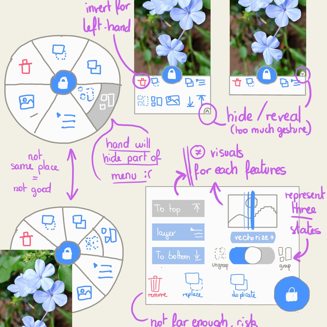
As we compared these ideas, we kept coming back to the same guiding principle: things should
be simple to understand and easy to use. The less friction we
introduce into your workflow, the more you can focus
on what really matters.
We also knew we wanted to preserve the long-press interaction,
which had become a familiar part of working with assets for so many users. A circular layout
felt like a natural fit for that gesture, keeping every action close to the finger that opened
the menu.
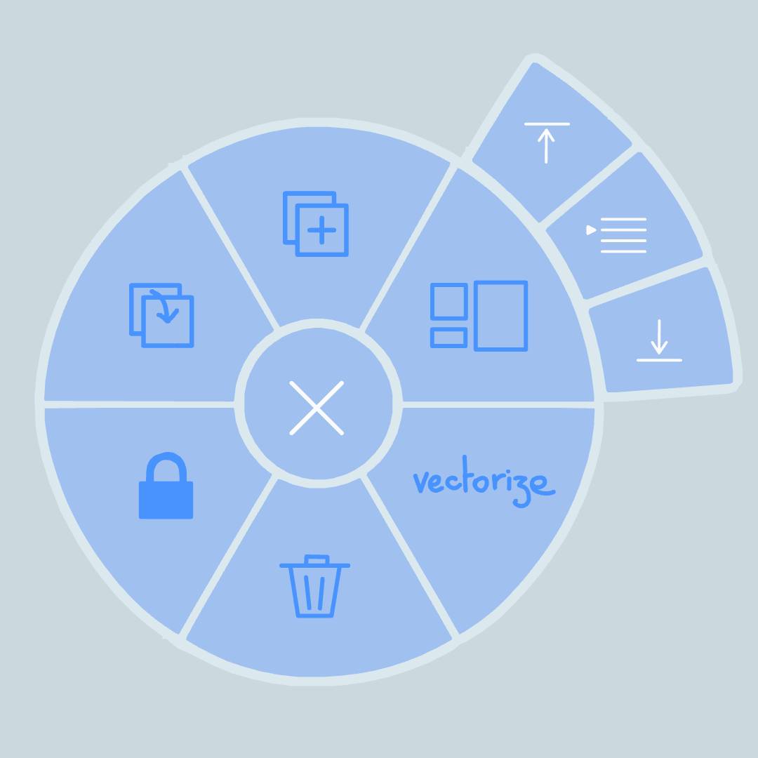
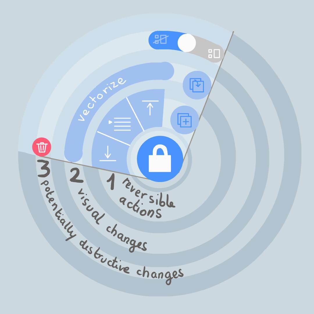
As we tried out these layouts, we quickly noticed that the user’s hand would cover much of a full-circle menu. We also found that not everyone on the team used their iPad in quite the same way. Some naturally approached the screen from the side, while others reached in from the bottom. We eventually settled on a half-circle, slightly tilted to keep everything visible, with a mirrored version for left-handed users.
With that basic shape in mind, we started thinking about where each action should go. While we wanted everything within easy reach, some actions needed to be closer than others. As with any interface, we followed a simple rule: the more important or frequently used a feature is, the closer it should be to your hand. On the other hand, potentially destructive actions, such as removing an asset, should sit farther from your finger, helping prevent accidental taps.
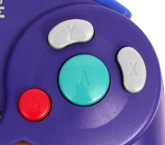
While positioning is important, it isn’t the only aspect to consider when designing a menu. Size and color also play a key role, as we can see on the iconic GameCube controller.
We wanted the different parts of our menu to be easy to tell apart, with each button’s position, size, and color reflecting the importance of its action. This led us toward an asymmetrical layout built around one main action, with the others arranged around it.
 Smart design:
The lock feature was by far the most frequently used, so it had to be the closest. And what could be closer than directly under your finger?
That placement also opened up an interesting new shortcut: you can now double-tap an active asset to lock it instantly!
This is exactly the kind of interaction we love discovering during the design process. A small adjustment to the layout creates an entirely new gesture, one that feels natural because it emerges directly from the way the interface works.
At this point, we could finally focus on fine-tuning the visual details: the colors, the right icon for each action, the animations...
We experimented with different interactive animations to find the right look and feel for the unlocking process, refining the transitions until everything felt fluid and consistent with the rest of the app.
In parallel, I went through every icon, making sure each one accurately represented its action. Where existing icons weren't quite right, we created new ones.
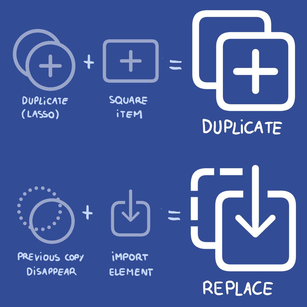
For instance, the duplicate and replace actions borrow heavily from the icons used in the lasso tool, but with a square shape instead of a circle. There's a reason for this: most imported assets are rectangular, while lasso selections are drawn freely by hand. Keeping these visual distinctions consistent helps reinforce the relationship between different tools across the app.
And finally, the testing phase! We now had our first functioning version of the menu, but we weren't quite done yet.
We shared the temporary version with users who had previously contacted us about the interface, and tested it internally as well. From there, we made further adjustments based on this new round of feedback, refining the details until we had something we could all feel confident about.
And that's how we generally approach design at Endless Paper! Of course, this was a special case, since the feature already existed and we had valuable user feedback to build upon.
You can imagine how much more involved the process becomes when we have to design not only
the interface, but also the underlying technology and an entirely new set of gestures!
We firmly believe that a good interface should feel
effortless. But, as you've seen, creating one actually takes quite a bit of
effort!